I spend most of my week on B2B SEO, but many of the best website lessons I use come from online stores. Ecommerce teams can measure every page and button against real sales, so their sites show you quickly what works.
In this guide, I walk you through 15 ecommerce website examples, from DTC brands like Allbirds and Glossier to B2B stores like McMaster-Carr and Grainger. I grouped them by what each site does best, so you can jump to the part of your store that needs the most work.
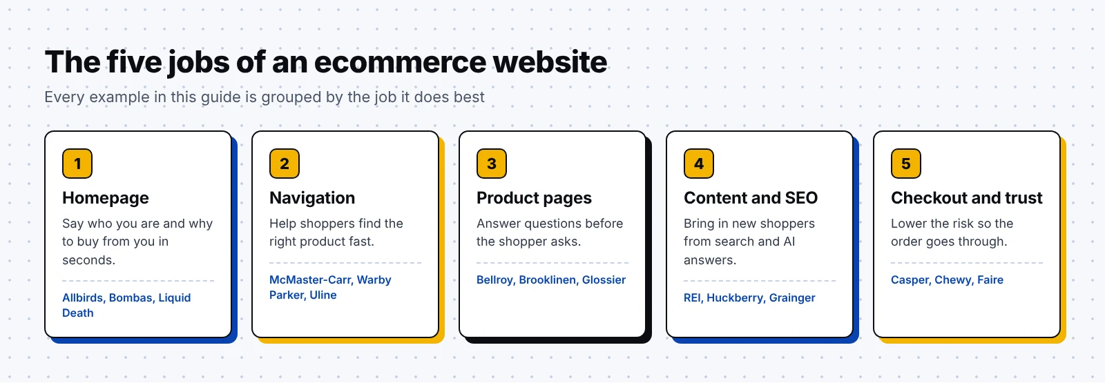
For each one, I cover what the company is, what stands out and what you can borrow, across five groups:
- Homepages that tell the brand story in a few seconds
- Navigation that helps shoppers find the right product
- Product pages that answer questions before shoppers ask them
- Content and SEO that bring in new shoppers every month
- Checkout and trust signals that get the order over the line
You'll also find a product page anatomy diagram and a launch checklist near the end.
What is an ecommerce website?
An ecommerce website is a site that lets people buy products online without talking to a salesperson. It covers a few business models:
- Direct to consumer (DTC) brands that make and sell their own products, like Allbirds or Bombas.
- Retailers that sell products from many brands, like REI or Chewy.
- B2B stores that sell supplies to businesses on account, like Grainger or Uline.
- Wholesale marketplaces that connect brands with shop owners, like Faire.
Every store's website has to do the same five jobs, and I use them to group the examples below.
How I picked these ecommerce website examples
Each store does one job clearly better than most in its category, and a small team could copy the idea on a normal budget. I included four B2B stores, since many of my readers sell to businesses.
I describe only what public sources show about each site. Store pages change often, so open each one yourself before you copy a detail.
Best ecommerce website examples for homepages and brand story
Your homepage has a few seconds to explain who you are and why someone should buy from you. These three brands carry one clear idea through the whole site.
1. Allbirds
Allbirds is a footwear and apparel company that builds its brand around making shoes and clothes with a lower carbon footprint.
What stands out is how Allbirds turns its main claim into a number. Since April 2020, the brand has published a carbon footprint for its products, measured in kilograms of CO2 equivalent, and it shares the method behind it in a public document.
According to that methodology document (last updated October 2024), the life cycle tool behind the numbers was verified by a third party against ISO 14067. That gives a skeptical shopper a way to check the claim for themselves.
What you can borrow:
- Pick the one claim that sets you apart and find a fair way to measure it, since a specific number is easier to believe than a general promise.
- Show that number in the same spot on every product, and link it to a page that explains how you got it.
2. Bombas
Bombas is an apparel company that sells socks, underwear and tees and gives away one item for every item it sells.
The line "One Purchased = One Donated" sums up the whole business in four words. Bombas says that for every item you buy, it donates a new item to one of its 3,500+ Giving Partners.
The idea came from something the founders learned in 2013: socks were the most requested item at homeless shelters. That story gives the giving model a clear reason to exist.
What you can borrow:
- Write your mission as one short line a shopper could repeat to a friend.
- Tie the mission to the purchase itself, so each order feels like it counts.
3. Liquid Death
Liquid Death is a beverage company that sells canned water and other drinks with branding borrowed from heavy metal and horror movies.
Its commerce site, which ArcTouch built with AKQA on Shopify, keeps the same voice as its ads. One line reads, "Don't be scared. It's just water."
Surprisingly, even the product listings play along. A Country Club membership listing on the site has shown a $125,000 annual fee, with the option to sell your soul to cover it. The site also has a store finder that detects your location.
What you can borrow:
- Carry your brand voice into product names, buttons and error messages, well past the homepage headline.
- Add a store finder if you also sell through shops and stockists.
Ecommerce websites with easy navigation and product discovery
A shopper who can't find the right product will leave and search somewhere else. These three stores solve discovery in very different ways.
4. McMaster-Carr (B2B)
McMaster-Carr is an industrial supply company that sells hardware and parts to engineers and maintenance teams.
Its site is famous among designers for what it leaves out. Reviews of the site describe a plain, mostly gray layout with no popups, carousels or banners, just product categories and a search bar.
The site shines at filtering, as one walkthrough of a bolt search shows: a keyword brings up subcategories, and a panel on the left narrows the results by details like thread size and length.
Why it works:
- Engineers already know the spec they need, so filters by spec get them to the part fastest.
- Fast, simple pages respect buyers who order parts many times a week.
What you can borrow:
- List the attributes your buyers use to choose a product, and turn each one into a filter.
- Test your site search with the exact part numbers and phrases your customers type.
5. Warby Parker
Warby Parker is an eyewear company that sells prescription glasses, sunglasses and contact lenses online and in its own stores.
Glasses are hard to buy online because you want to see them on your face first, so Warby Parker built a style quiz and a Virtual Try-On feature.
The quiz asks a few quick questions and recommends frames in the colors, shapes and styles you like. Virtual Try-On uses your camera to place frames on your face to scale, and the app can suggest the best frame width for you.
Fortunately, its privacy policy also says it doesn't store these face scans or share them with third parties, which helps anyone who feels nervous about turning on the camera.
What you can borrow:
- Find the biggest worry that stops people buying your product online, and build a tool or guide that answers it.
- Explain how you handle personal data right next to any feature that collects it.
6. Uline (B2B)
Uline is a distributor of shipping, packaging, industrial and janitorial supplies for businesses across North America.
Its site works like an online version of its print catalog, which Uline says runs to 890+ pages and more than 45,000 products. Customers can order by phone, fax or online at any hour.
Conveniently, the site also handles reordering well. A 2022 trade profile noted that users can view order history, track orders and browse items sold only online.
What you can borrow:
- Match your categories to the way buyers already think about your products, such as the sections of a print catalog or a parts list.
- Publish your shipping cutoff time in plain sight, like Uline's "Order by 6 PM" promise for shipping the same day.
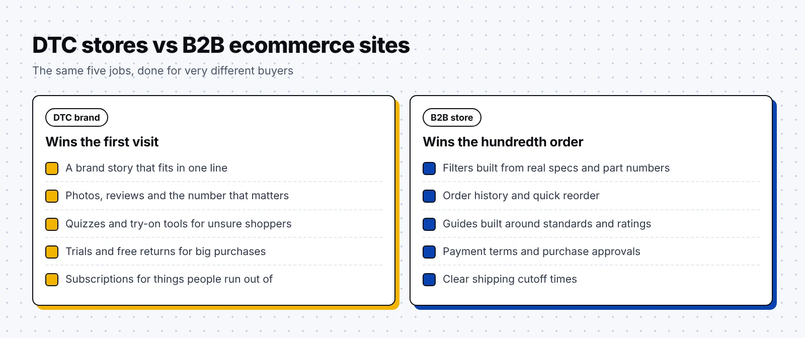
B2B stores solve different problems from DTC brands, as this comparison shows.
Ecommerce product page examples
The product page is where most buying decisions happen, and the best ones answer the questions a shopper would ask a store clerk.
7. Bellroy
Bellroy is an accessories company that designs slim wallets, bags, phone cases and travel gear.
Bellroy's product pages lead with the fact that matters most for a wallet. The Card Slip page says it keeps up to four cards together, and the Mag Wallet page says it holds three cards and snaps onto a MagSafe phone.
The brand also built its name on carrying less. Its "Slim Your Wallet" campaign shared tips like sorting cards by how often you use them and photographing receipts.
What you can borrow:
- Put the number your shopper cares about most, like capacity or size, in the first lines of the page.
- Pair your product pages with helpful tips that make the problem your product solves easy to see.
8. Brooklinen
Brooklinen is a bedding and home goods company that sells sheets, comforters, towels and loungewear online.
Sheets are hard to compare, so Brooklinen spells out the details. The brand says it publishes the cotton type, thread count and weave on every product page.
Its sheet buying guide then explains what those details mean. Brooklinen says its Classic percale is a 270 thread count and its Luxe sateen is a 480, and it tells shoppers to look for a thread count no higher than 500.
Thankfully for shoppers, the guides also match fabrics to sleepers. Brooklinen describes its sateen as a little warmer, which suits cool sleepers, and points hot sleepers toward its washed linen.
What you can borrow:
- Publish the same spec fields on every product, so shoppers can compare without making a spreadsheet.
- Write buying guides that explain each spec in plain words, and link to them from the product page.
9. Glossier
Glossier is a beauty company that sells skincare, makeup and fragrance, and it built its brand around a close community of fans.
Its product pages lean on customer voices. On the Balm Dotcom page, you can read more than 10,000 reviews, where people share details like how the tinted shades look on darker lips.
Glossier also labels reviews that came from gifted products, a small note that helps shoppers trust the rest.
What you can borrow:
- Show your rating and review count right next to the product name.
- Ask reviewers for the details future buyers care about, such as skin type, shade or fit.
Anatomy of a high-converting ecommerce page
Put those product page ideas together, and you get a clear pattern. Here is how I lay out an ecommerce product page that converts, from top to bottom.
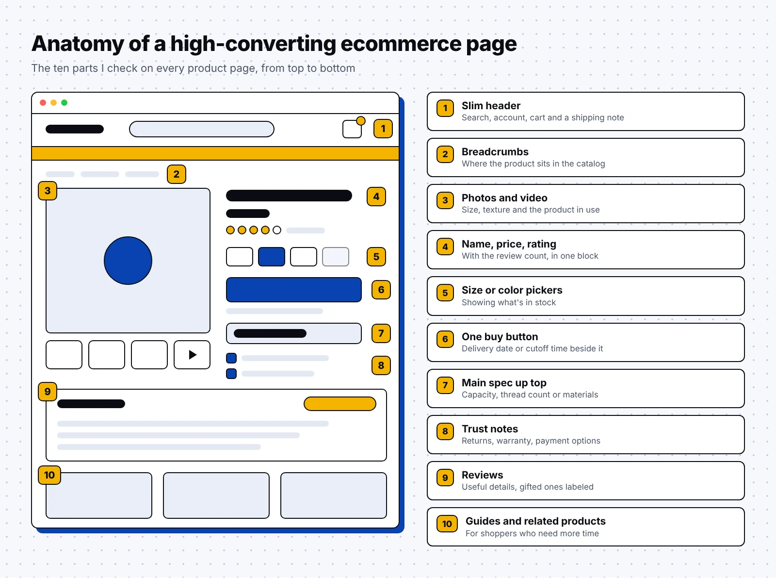
- A slim header with search, account, cart and a short shipping note.
- Breadcrumbs that show where the product sits in your catalog.
- Photos and a short video that show size and the product in use.
- The product name, price, rating and review count in one block.
- Pickers for size or color that show what's in stock.
- One main buy button with the delivery date or cutoff time beside it.
- The main spec in the first lines, like capacity, thread count or materials.
- Trust notes by the button, such as returns, warranty and payment options.
- Reviews with useful details and labels for gifted products.
- Links to buying guides and related products.
Luckily, most of these parts cost very little to add. They're copy and layout choices you can usually make inside your current store theme.
Ecommerce sites that win with content and SEO
The strongest stores also build content that ranks on Google and gets cited in AI answers, because that traffic keeps coming after an ad campaign ends. These three show how guides and stories bring shoppers in early.
10. REI
REI is an outdoor retail cooperative that sells gear and clothing for hiking, camping, climbing, cycling and many other activities.
Its Expert Advice section is one of the best content hubs in retail. Articles are grouped by activity, like mountaineering or backcountry skiing, and tagged by type, such as Buying Advice, Gear Guides, Care and Repair, Skills and Checklists.
Interestingly, that structure matches how people search, so someone who types "how to choose mountaineering boots" can land on an REI guide with that exact title, from the same store that sells the boots.
What you can borrow:
- Build a content hub for each product category, and fill it with "how to choose" guides.
- Write guides that help a shopper even if they buy elsewhere, since those earn trust and links.
11. Huckberry
Huckberry is an online retailer that sells outdoor clothing, gear and goods for men, alongside an editorial section called the Journal.
Huckberry treats content as part of the store, and a profile in Field Mag says the founders made editorial a core part of the business from day one.
In an interview with Glossy, Huckberry's head of marketing said the team turns its travels and product tests into stories for the email newsletter. He also called email the company's most profitable channel.
What you can borrow:
- Write about how your products get used, and link each story to the items in it.
- Reuse the same stories in your email newsletter, so one piece of content does two jobs.
- Give content a real owner and a steady schedule, like the two to three posts a week a Huckberry job post asked of its Journal editor.
12. Grainger (B2B)
Grainger is an industrial supply distributor that sells maintenance, repair and operations products to businesses.
Its KnowHow library shows what good B2B ecommerce content looks like, with guides that answer practical buying questions, like how to compare cooling ratings on portable air conditioners or how to pick safety gloves, including a glove size chart.
Grainger also runs punchout catalogs, which connect its catalog to a customer's own purchasing system so each order can go through internal approvals first.
Honestly, I think content is where B2B stores have the most room to grow, and it's the work we focus on as a B2B SEO agency.
What you can borrow:
- Write guides around the standards and specs your buyers must meet, such as safety rules or efficiency ratings.
- If you sell to large companies, ask which purchasing systems they use and plan for them early.
Buyers also ask ChatGPT which products to pick now. A GEO agency can track whether AI tools mention your store, or you can start with our free AI visibility audit.
Ecommerce checkout and trust examples
Baymard Institute, a UX research firm, puts the average online cart abandonment rate at 70.19%, based on 48 studies. In its survey of US shoppers, extra costs like shipping, taxes and fees were the top reason people left during checkout.
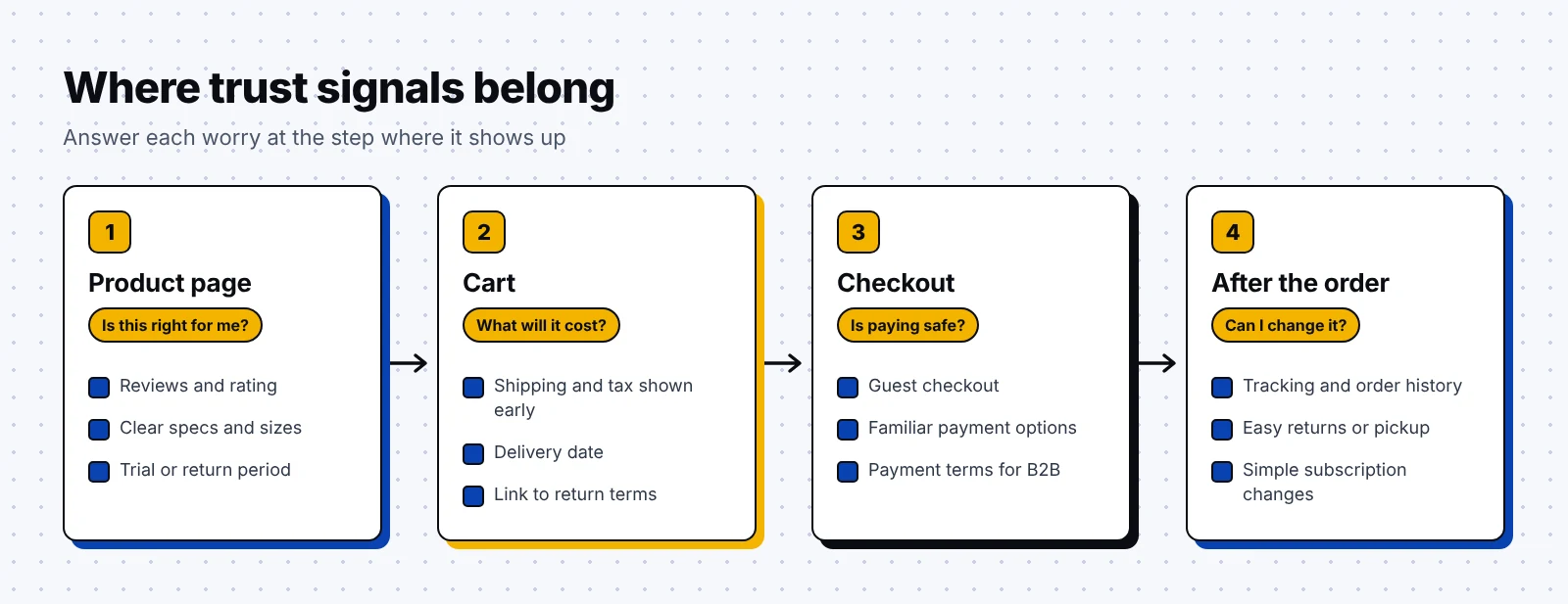
The three stores below lower the risk of buying in ways that fit what they sell. I like to place trust signals at the exact point where a shopper starts to worry, as in this diagram.
13. Casper
Casper is a sleep company that sells mattresses and other sleep products online.
A mattress is hard to judge from a short test in a store, so Casper gives you a 100 night trial that starts when your order is delivered.
Its Casper Promise page lays out the details plainly: after a 30 night adjustment period, returns are free, and Casper arranges a courier to pick up the mattress on your schedule.
What you can borrow:
- Give big purchases a trial long enough to feel real, and say exactly when it starts.
- Take on the hard part of a return yourself, like the pickup or the packing.
14. Chewy
Chewy is an online pet retailer that sells food, supplies and pharmacy items for dogs, cats and other pets.
Its Autoship program turns a single order into a repeat order. On its Autoship page, Chewy gives 35% off a first Autoship order, up to $20 off, and 5% off eligible items on future Autoship orders.
Helpfully, shoppers stay in control after they sign up. In Manage Autoship, they can change how often orders arrive, move a shipping date up to 24 hours before it ships, or cancel future shipments.
What you can borrow:
- If customers run out of your product, offer a subscription option on the product page and in the cart.
- Make it simple to change or cancel a subscription, and say so before people sign up.
15. Faire (B2B)
Faire is a wholesale marketplace company that connects independent retailers with brands that want to sell to shops.
For a shop owner, the hard parts of wholesale are cash flow and the risk of stocking a new brand. Faire's help center covers both: eligible retailers can pay up to 60 days later, and the first order with any brand qualifies for free returns.
What you can borrow:
- Offer payment terms to business buyers who qualify, and show those terms before checkout.
- Lower the risk of a first order with a return option or a smaller starter order.
All 15 ecommerce website examples at a glance
| Example | Type | One idea to borrow |
|---|---|---|
| Allbirds | DTC | A measured claim shown on every product |
| Bombas | DTC | A mission in one short line |
| Liquid Death | DTC | One brand voice on every page |
| McMaster-Carr | B2B | Filters built from real specs |
| Warby Parker | DTC | A quiz and virtual try on for the main worry |
| Uline | B2B | Catalog categories and a clear cutoff time |
| Bellroy | DTC | The capacity number in the first lines |
| Brooklinen | DTC | The same spec fields on every product |
| Glossier | DTC | Many reviews, with gifted ones labeled |
| REI | Retailer | A "how to choose" hub per category |
| Huckberry | Retailer | Stories reused in email |
| Grainger | B2B | Guides built around specs and standards |
| Casper | DTC | A long trial with free pickup |
| Chewy | Retailer | A clear subscription offer |
| Faire | B2B | Payment terms and safe first orders |
How to use these ecommerce website examples on your own store
Copying 15 ideas at once muddies your results, so work through them one job at a time:
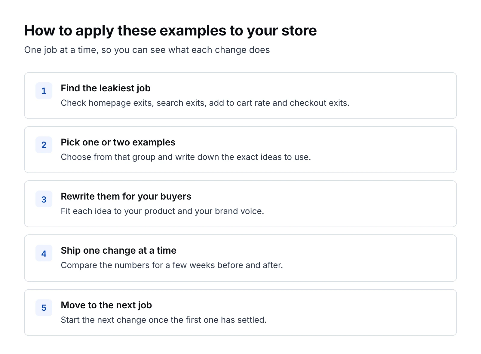
- Find the job where your store loses the most shoppers by checking homepage exits, search exits, add to cart rate and checkout exits in your analytics.
- Pick one or two examples from that group, and write down the exact ideas you could use.
- Rewrite each idea for your product and your buyers in your own brand voice.
- Ship one change at a time, and compare the numbers for a few weeks before and after.
- Move on to the next job once the first change has settled.
If you sell to businesses, my list of B2B website examples pairs well with this one, and my guide to SEO best practices covers the search basics.
Ecommerce website launch checklist
Before you launch a new store or a redesign, run through this checklist.
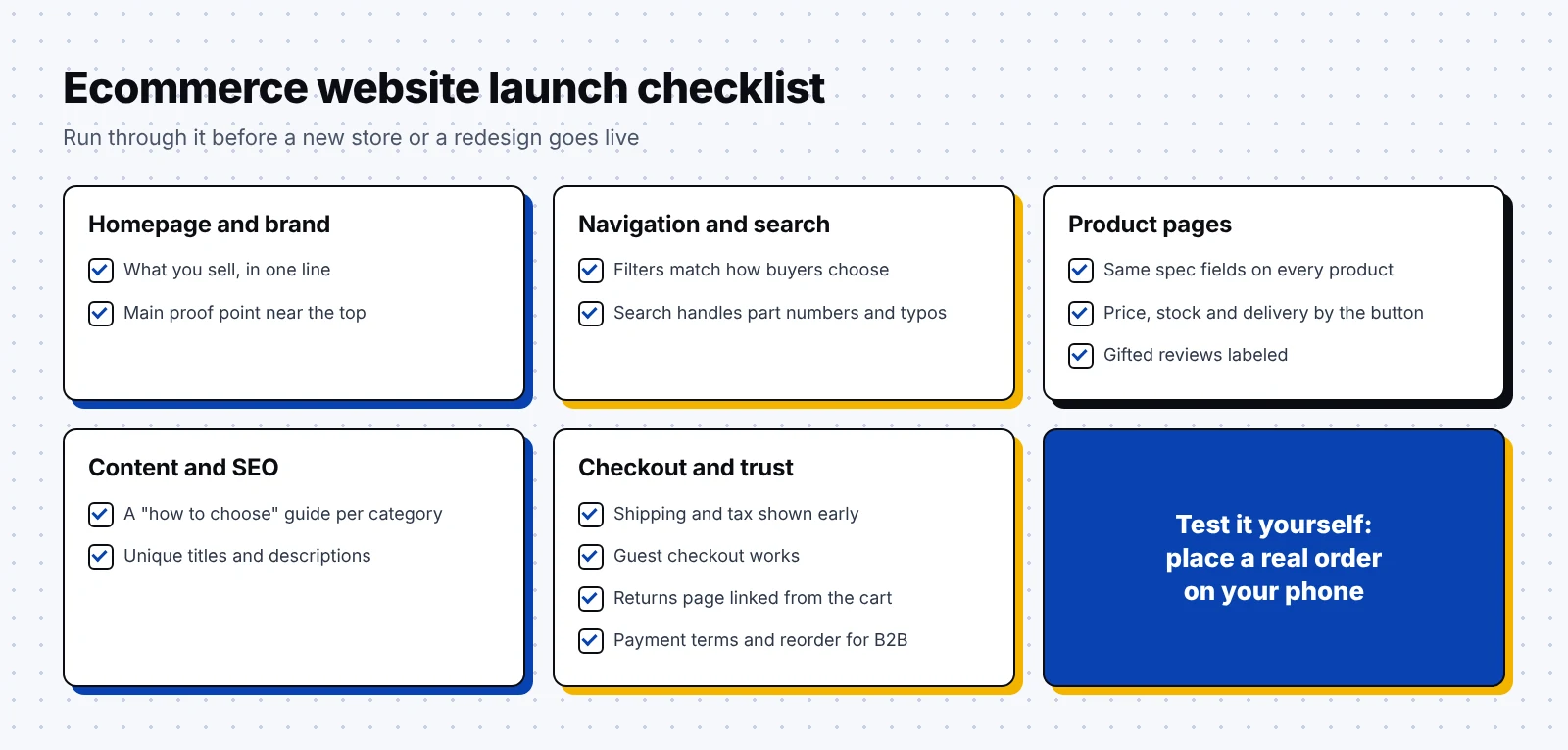
Homepage and brand:
- The first screen says what you sell and who it's for in one line.
- Your main proof point, like a rating, a measured claim or a guarantee, shows near the top.
Navigation and search:
- Filters match the attributes buyers use to choose.
- Site search handles product names, part numbers and common misspellings.
Product pages:
- Every product has the same spec fields filled in.
- Price, rating, stock and delivery date sit near the buy button.
- Reviews are live, and gifted reviews are labeled.
Content and SEO:
- Each main category has at least one "how to choose" guide that links to products.
- Page titles and descriptions are unique, and product pages are open to search engines.
Checkout and trust:
- Shipping costs and taxes show before the last checkout step.
- Guest checkout works, and account creation is optional.
- Returns, trial periods and warranty terms have their own page, linked from the cart.
- B2B buyers can see payment terms, order history and a quick reorder option.
Happily, you can test most of this list in an afternoon by placing a real order on your phone.
FAQ
What is an example of an ecommerce website?
Allbirds, Warby Parker and Glossier are popular DTC ecommerce websites. REI and Chewy are retailers that sell many brands, and McMaster-Carr and Grainger are B2B ecommerce sites.
What makes a good ecommerce website?
A good ecommerce website explains what you sell on the first screen and helps shoppers find the right product fast. It also shows costs and return terms early, so shoppers feel safe at checkout.
What pages does an ecommerce website need?
Most stores need a homepage, category pages, product pages, a cart and checkout, and pages for shipping, returns and contact details. Buying guides and a blog help new shoppers find you through Google and AI search.
How is a B2B ecommerce website different from a DTC store?
B2B buyers often know the exact spec they need, reorder often and pay on account. So B2B sites focus on spec filters, order history and payment terms, while DTC stores lean more on brand story and reviews.
What is the average cart abandonment rate for ecommerce sites?
Baymard Institute puts the average online cart abandonment rate at 70.19%, based on 48 studies. Extra costs like shipping, taxes and fees were the top reason for leaving checkout in its survey of US shoppers.
For your next step, open your own store on your phone, pick the group above where it struggles most and copy one idea this week. If you'd like help turning your product pages and guides into steady organic traffic, book a call with me.

Want to keep learning? Read our guides on B2B website examples, increasing website traffic, B2B content marketing examples and BOFU content.