

I love doing SEO for B2B. The work is inherently more strategic and higher-impact than B2C, which I’ve seen firsthand both in-house and as a B2B SEO agency owner.
Along that journey, I’ve seen a fair share of many beautifully designed B2B websites. A beautiful website isn’t going to magically to bring you pipeline and organic growth, but it sure is a big contributing factor.
In this article, I’m going to share with you the best B2B website examples I’ve come across. And since “B2B” is a pretty big industry, I’m going to break it down to several smaller verticals, including:
- B2B SaaS websites
- Professional service websites (Consulting, agencies, legal, accounting, IT services)
- Manufacturing & industrial websites
- B2B Healthcare and Life Science
Let’s dive in!
What should a B2B website have?
I think there are three important factors that make a good website:
- It should have clear messaging. This is actually a big problem in many B2B deep-tech companies. Their product is usually too complex for copywriters and marketers to properly nail the messaging. If you manage to write website copy without the fluff, you’re already winning.
- It should be modern. B2B SaaS websites have largely set the bar for modern web design. However, a lot of other B2B niches like industrial or healthcare tend to be more old-school. A little bit of revamping with modern web design best practices can bring new life to your online presence. Modern web design also goes with better User Experience, which helps your potential customers make purchasing decisions more easily.
- There should be good branding. If you want to invest into your online presence, that presence should tell a story, from positioning and tone of voice to visuals and messaging hierarchy.
Here are what some of the best B2B websites include on their site:
- A homepage that clearly shows what the product/service is
- Product/service offerings
- An about page about the company
- A blog that leverages SEO to grow organic traffic on the site
- A beautiful design that shows off the brand
- A footer that mentions all of the points above
Okay, now I think you’re ready to browse through the best B2B websites out there!
Best B2B SaaS website examples
1. Dovetail (Research tool)
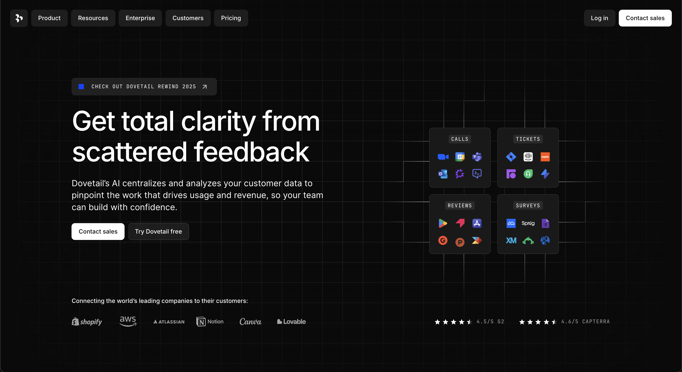
Dovetail is a research repository that organises customer analysis in one intuitive and cooperative platform. It includes four main products: Markup, Playback, Backstage, and Enterprise.
Website: Dovetail
What’s so cool about Dovetail:
- They use the JetBrains Mono font for tags and Inter for body text. These are all fonts that SaaS designers love for their minimalism and the “technology” feel.
- Black background with white text gives off a luxury and “Dark mode” vibe, which is appealing to tech users.
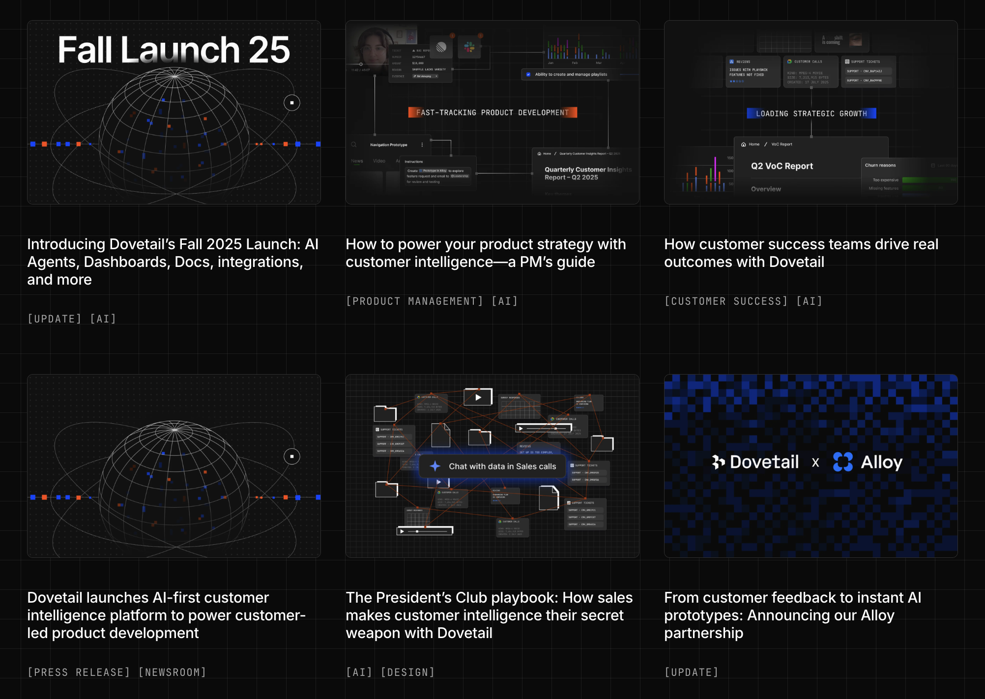
- A well-designed blog with a fine balance between Industry insights and SEO-optimized articles to bring in organic visitors.
2. Attio (CRM)
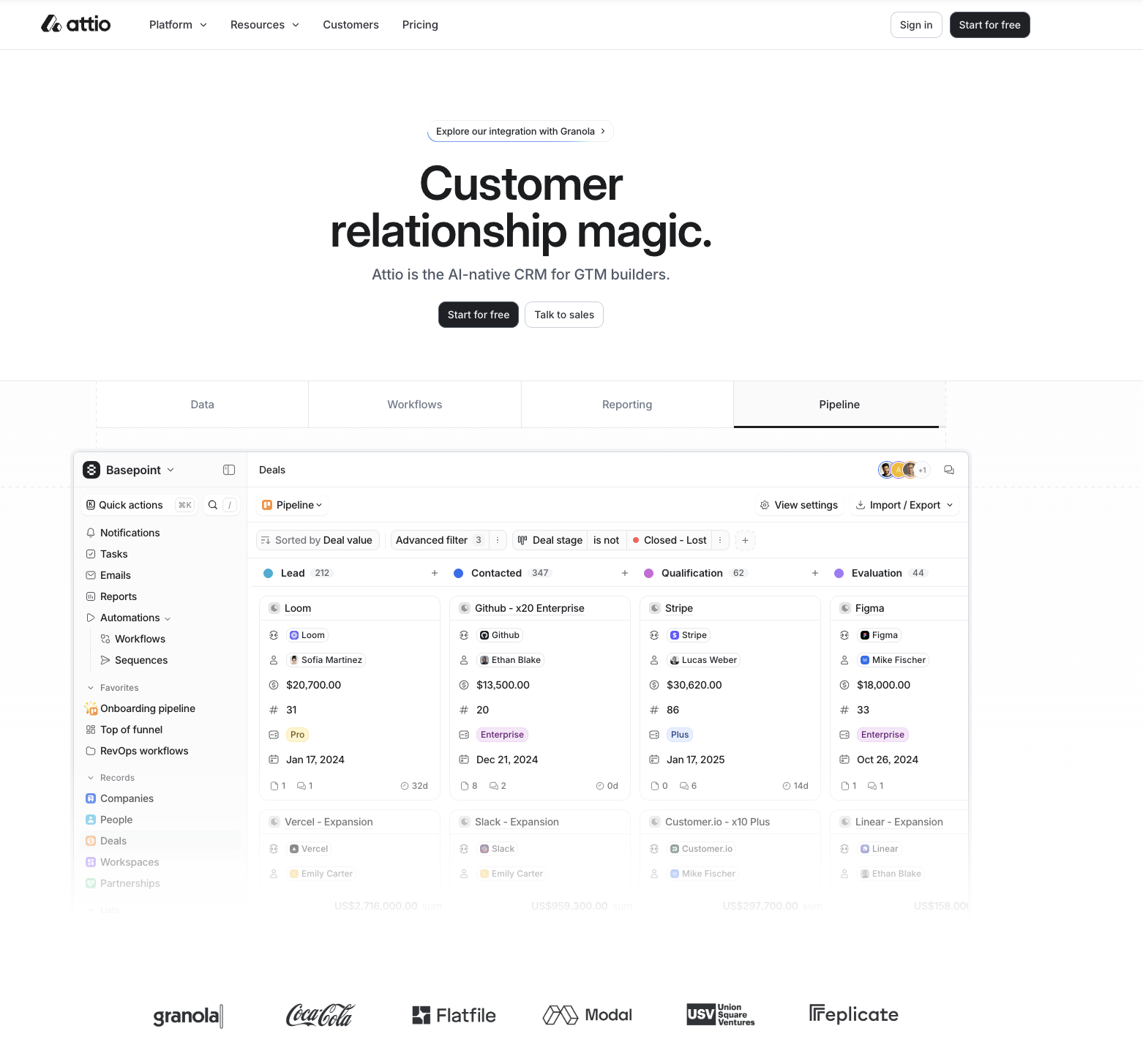
Attio is a flexible data-driven platform that empowers teams to build the exact CRM that’s right for their business. It offers all the tools you’ll ever need to create real-time global databases of every contact and company your business interacts with.
Website: Attio
What’s good about Attio:
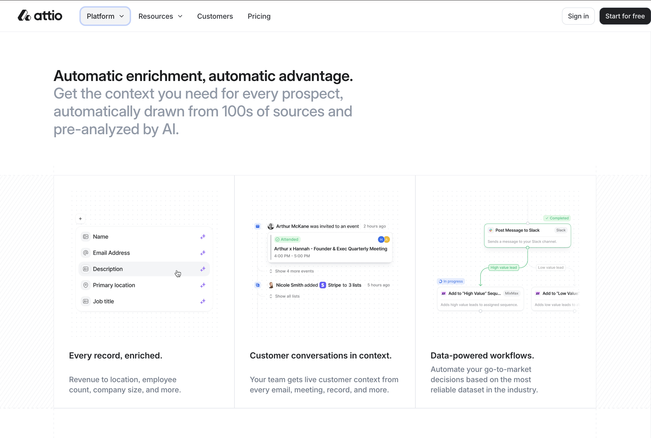
- They have classic product-led UI aesthetic where the interface is the hero. There is real workflow components (nodes, triggers, sequences) are used as visual proof. The UI doubles as documentation + marketing.
- Design-wise, Attio follows modern SaaS minimalism with neutral typography. This is “serious software” branding
- I really like how they have no aggressive CTAs and no feature dumping. Instead, the page calmly states capability and lets the UI prove it. This design is perfect when your buyer is more technical or revenue-critical. It’s That’s enterprise-grade confidence design.
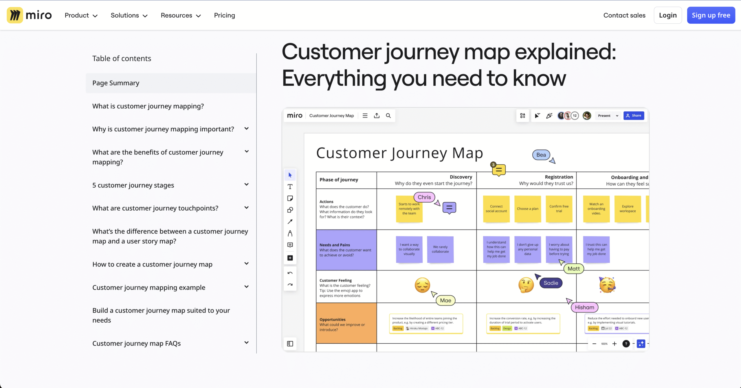
3. Miro (Collaboration tool)
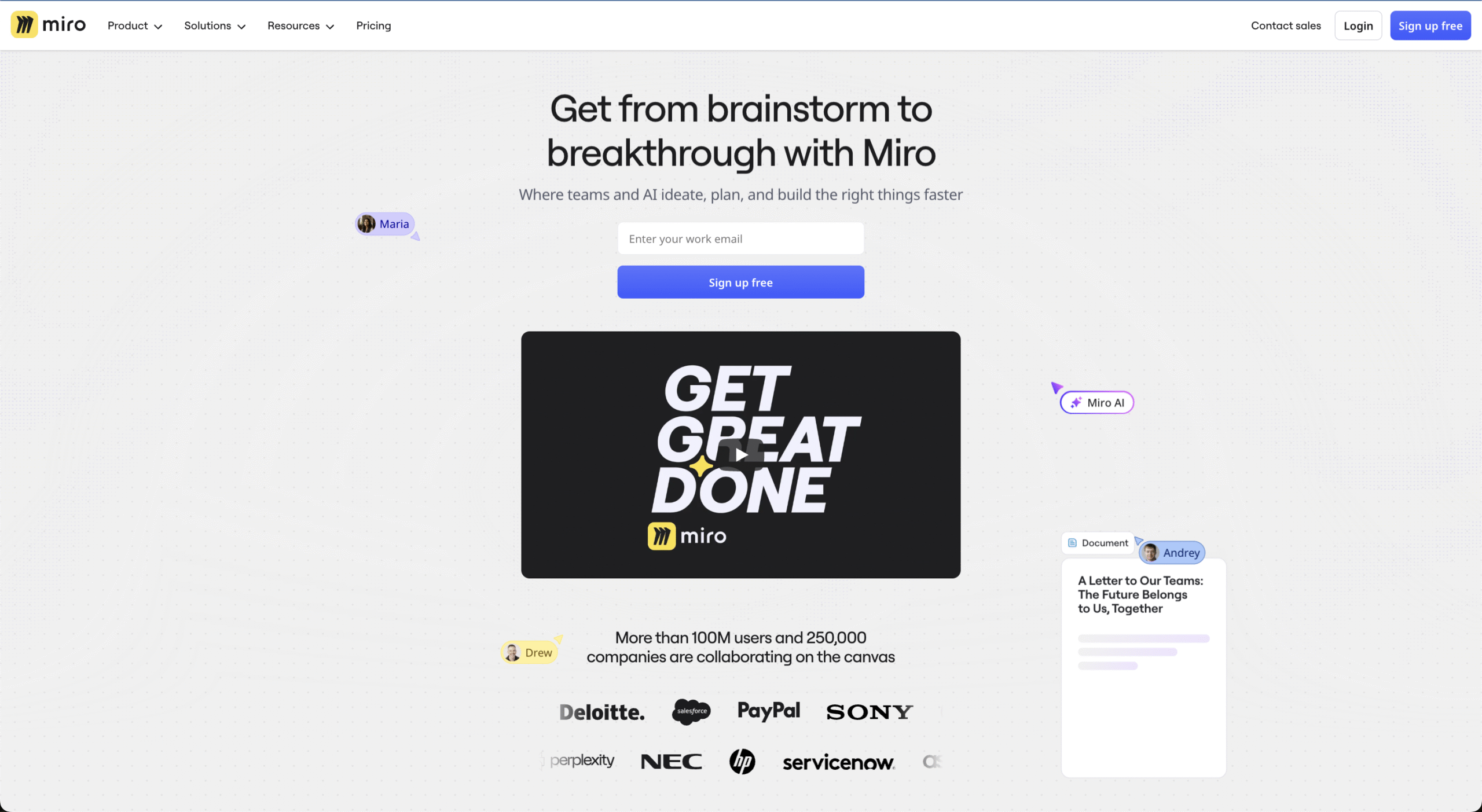
Miro is an online collaborative whiteboard platform that enables remote teams to collaborate more efficiently with the help of a suite of features to brainstorm sessions, plan projects, and design new products.
Website: Miro
What’s good about Miro:
- Miro brings their product design to the customer-facing part. The homepage mirrors the actual product experience of the infinite whiteboard and objects floating around in space. This is called WYSIWYG product marketing (What you see is What you get).
- Their design evokes a sense of creativity and collaboration
- Their blog doubles as both SEO and Product Education.
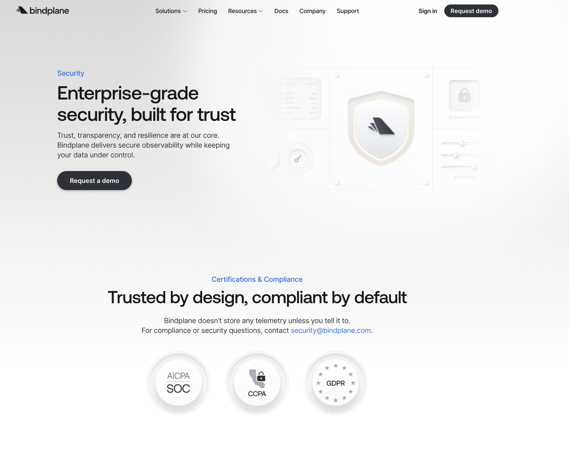
4. Bindplane (Telemetry pipeline)
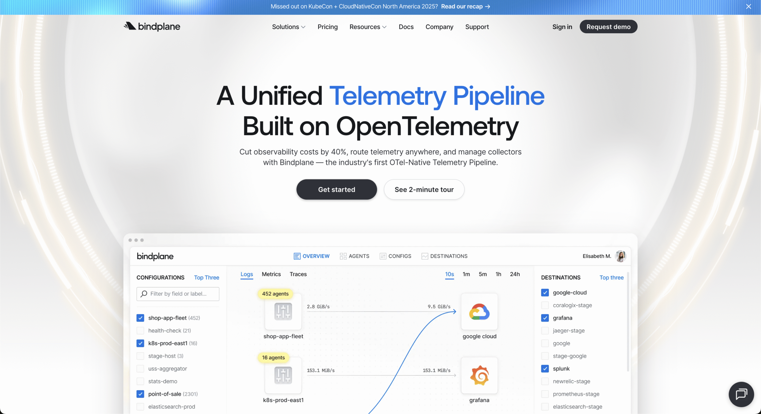
Bindplane (formerly ObservIQ) is an observability pipeline management platform for IT operations and DevOps teams. Telemetry Data Routing collects, processes, and routes observability data (logs, metrics, traces) from any source to any destination without vendor lock-in.
Website: Bindplane
What I like about Bindplane:
- This one is a very classic deep-tech / infra SaaS site
- Unlike Attio (modular) or Miro (exploratory), this page is linear by design. There’s a clear textbook enterprise UX: from High-level value proposition –> Capabilities & use case –> Efficiency / cost justification –> Platform unification –> Compliance & credibility –> Community + open-source alignment
- Design-wise, Bindplane leans more towards “modernized enterprise” rather than cutting-edge SaaS. You’ll notice clean but slightly restrained gradients (a hallmark of enterprise design). Card-based layouts and explanatory rather than “provoking” illustrations also appeal to the Enterprise audience.
- On their Resources tab they prioritize the Security page, which also aligns with the Enterprise positioning.
5. Posthog (Product Engineering tool)
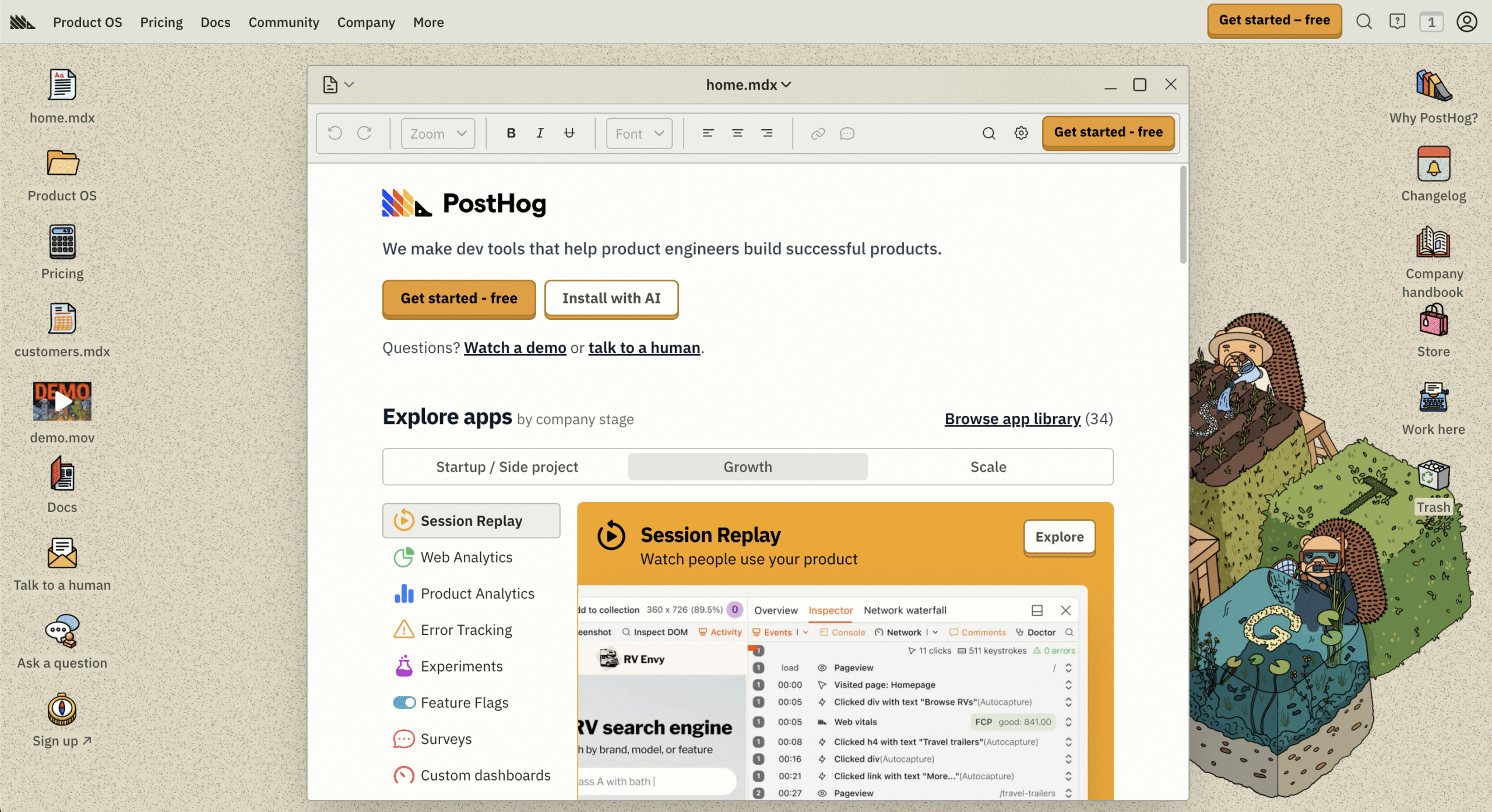
PostHog is a developer-first “Product OS”: one platform that bundles multiple product-engineering tools you’d normally stitch together: product analytics, session replay, feature flags, experiments, CDP-ish data plumbing, and more. They are marketed as “dev tools for product engineers.”
Website: PostHog
What I like about PostHog:
- I think it’s safe to say that PostHog has the best UI/UX/branding this world has ever seen. Their website is structured as one big “OS” on which websites pop up, and you can interact with those websites.
- One of the major decision of why PostHog follows this approach is supposedly because they had too many products, so having an OS-like design helped them managed the product better.
- They narrowed their ICP to engineers / technical founders (they cite ~80% of users) and oriented product + brand accordingly. They are also strongly product-led, so their website acts as their storefront, basically a sales team. The website must demonstrate ALL of the product’s core competencies, and PostHog has been really successful at that.
- The brand voice is distinct too. They’re blunt, anti-fluff, anti-euphemism. That opinionated nature makes them more human and therefore it connects better with their technical audience.
6. Homerun (HR tool)
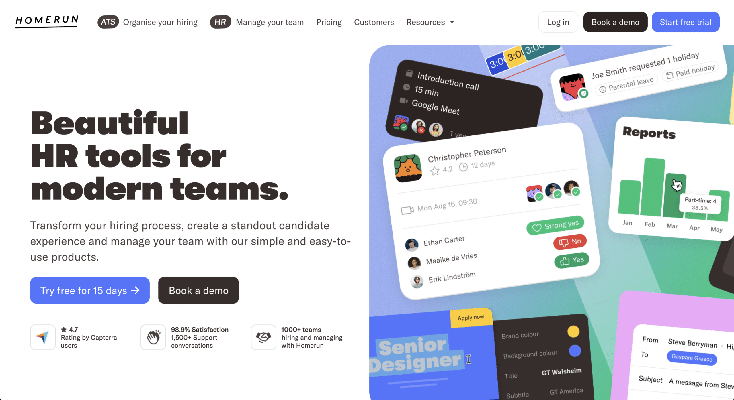
Homerun is an online tool that helps businesses attract talents with custom job posts and tailored application forms. The product provides a clear overview of each candidate that hiring managers can share and review with the rest of the team.
Webiste: Homerun
What I like about Homerun:
- Brand-led UI that humanizes HR software
- Clear product separation without cognitive overload
- Calm, confidence-building conversion flow
More B2B SaaS website examples
B2B SaaS is honestly where you will find the pinnacle of web design. These websites satisfy both aesthetics and practicality. I’ll add several more honorable mentions below:
- Revolut X: the Crypto exchange for pros. Really futuristic.
- Wynde.io: a platform for product teams to validate UX solutions and find the right participants for their study
- Operate.so: a platform to manage the entire Sales process
Still haven’t found the website that “clicks” yet? Okay, here’s my secret: SLP (SaaS Landing Page) is the ultimate website you need. From B2B SaaS, Design, Productivity, to Fintech, they have all sorts of websites imaginable there. That’s where you’ll find the website you’ll love.
But here’s the catch: you won’t find examples of B2B websites in non-SaaS niches like Professional services or Manufacturing.
So, read on, here are several more:
B2B professional service websites examples
7. Prophet (Management consulting)
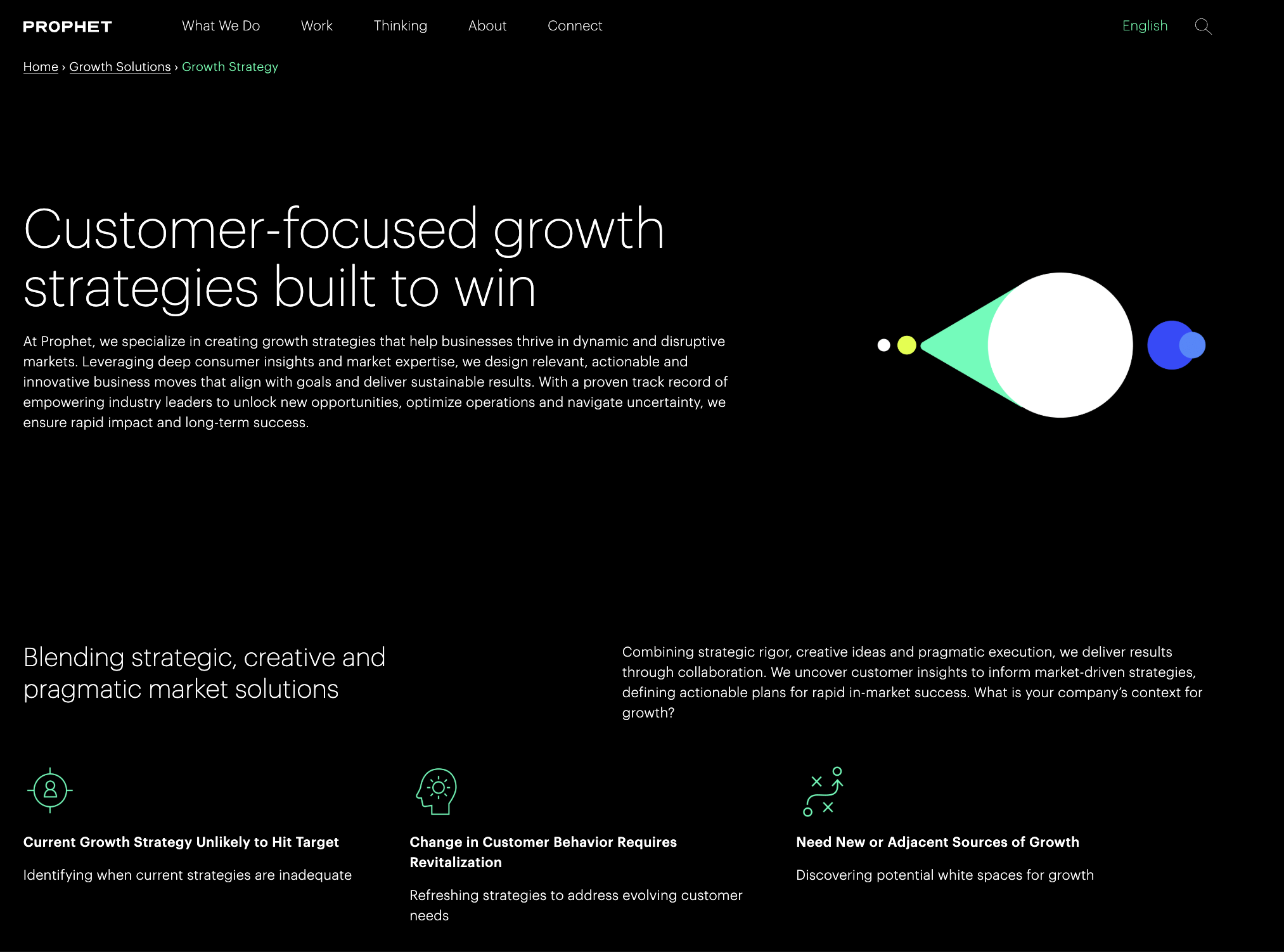
Let’s move to the world of B2B professional services websites.
Prophet is a global consultancy that helps companies unlock growth through brand, marketing, and experience transformation.
Website: Prophet
What I like:
- Prophet’s website is truly a masterclass in clean design and intellectual authority. The color palette is really professional and modern, along with a crisp typography that sets them apart. The hero section uses a powerful, rotating set of headlines that immediately communicate the high-level, strategic outcomes they deliver (“Growth for a changing world”).
- They also have a “Thinking” section with a wide variety of articles, reports, and insights that establish Prophet as a thought leader in their space.
- It’s also clear that they have strong brand guidelines in place to guide all of their communication activities.
8. Mitchell Adam (Financial Recruitment)
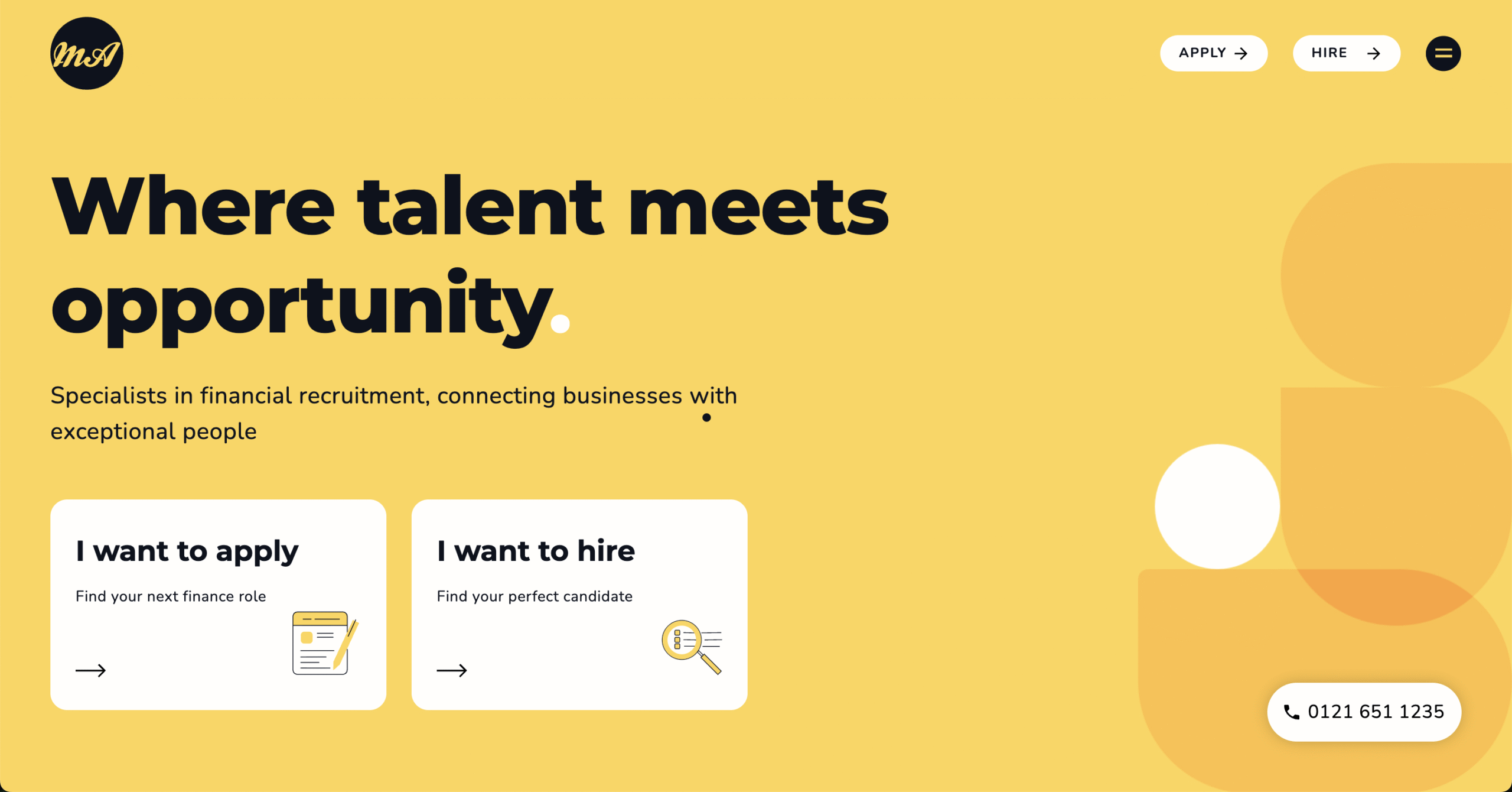
Mitchell Adam is a specialist recruitment agency for finance and accounting professionals.
Website: Mitchell Adam
What I like about their design:
- The homepage immediately forces a choice, “Find me a job” or “Find me a candidate.” Each user’s journey is tailored to their specific needs.
- The design is professional, clean, and trustworthy, which is crucial in the finance sector.
- The “Meet the Team” page acts as a trust signal.
9. Stord (Logistics and tech)
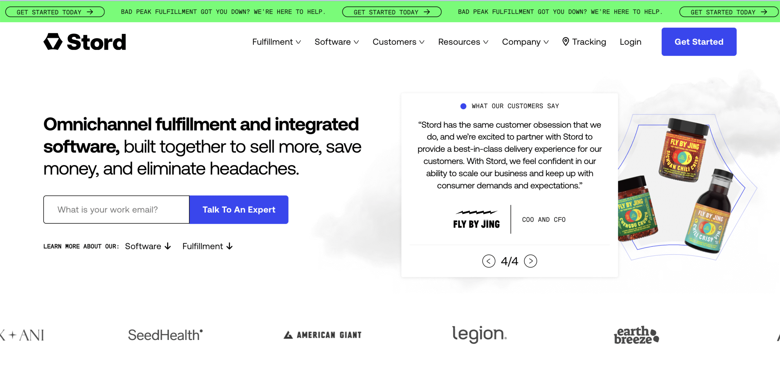
Stord is a cloud-native supply chain & logistics platform that helps brands manage and scale their fulfillment, warehousing, and transportation, all from one integrated system. Stord is often described as a “Cloud Supply Chain” solution because it combines physical logistics infrastructure with digital control software.
Website: Stord
What’s great about Stord’s website:
- They have a modern B2B SaaS/Enterprise-Lite design, which is the dominant style used by high-growth infrastructure, logistics, fintech, and ops platforms.
- There’s a large, confident value-prop headline. In terms of color palette, they use a neutral base color (white/gray) + one strong brand accent (green).
- Since they offer one software product and one service, they clearly separate the two.
B2B Manufacturing and Industrial Website Examples
10. GE Vernova
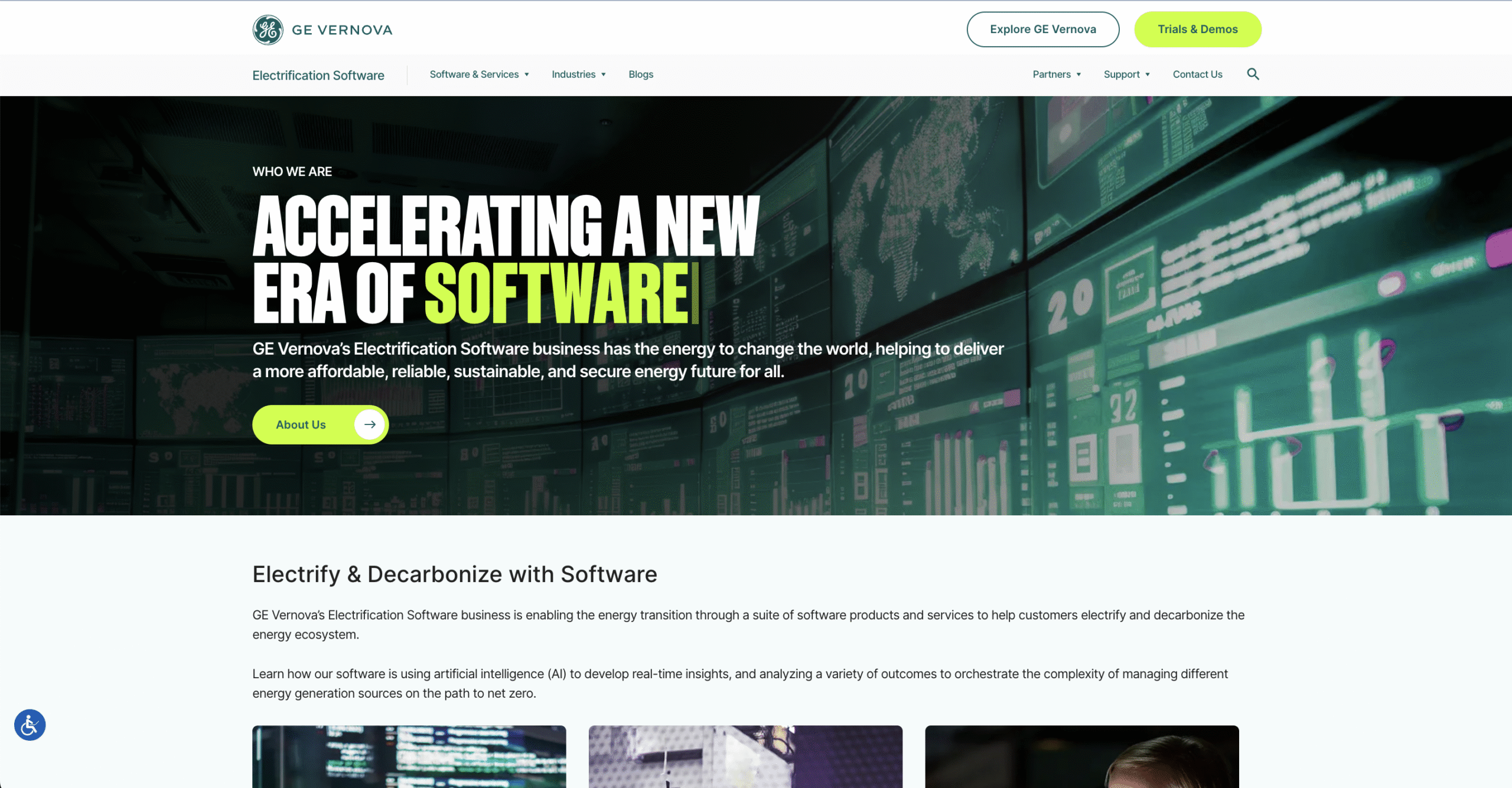
GE Vernova is GE’s energy-focused business, formed to deliver power, wind, electrification, and grid software solutions that help industrial companies generate and transmit electricity at scale. It brings together hardware-heavy energy infrastructure with software to support the global energy transition.
Website: GE Vernova
What I like about their website:
- The website uses a Modern Industrial Enterprise design style with simple layout and confident messaging.
- Although not as flashy as B2B SaaS websites, it accomplishes the job of an enterprise website.
11. ProtoLabs
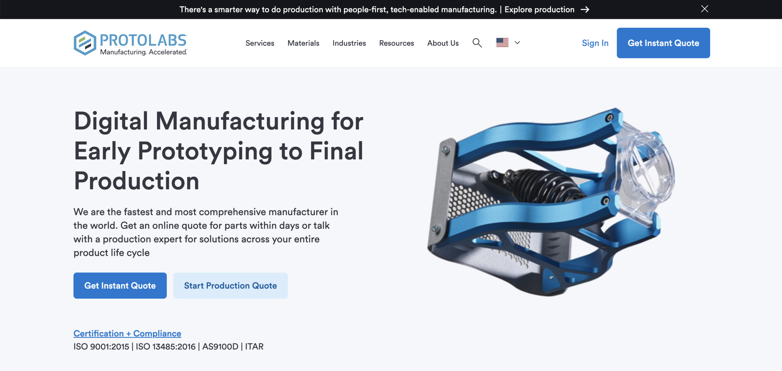
ProtoLabs is a rapid prototyping and on-demand manufacturing (CNC machining, injection molding, 3D printing).
Website: Proto Labs
What I like about Proto Labs:
- Simple and straight-to-the-point messaging, and it works.
- They certainly have a strong SEO and content marketing team to help them boost online presence. I wrote a brief analysis of Proto Labs’s SEO success here.
- They also have strong self-serve flow with their “Get Instant Quote” CTA, which definitely sets them apart from other manufacturing companies. This is one of the best examples of manufacturing-as-a-service design.
12. Xometry
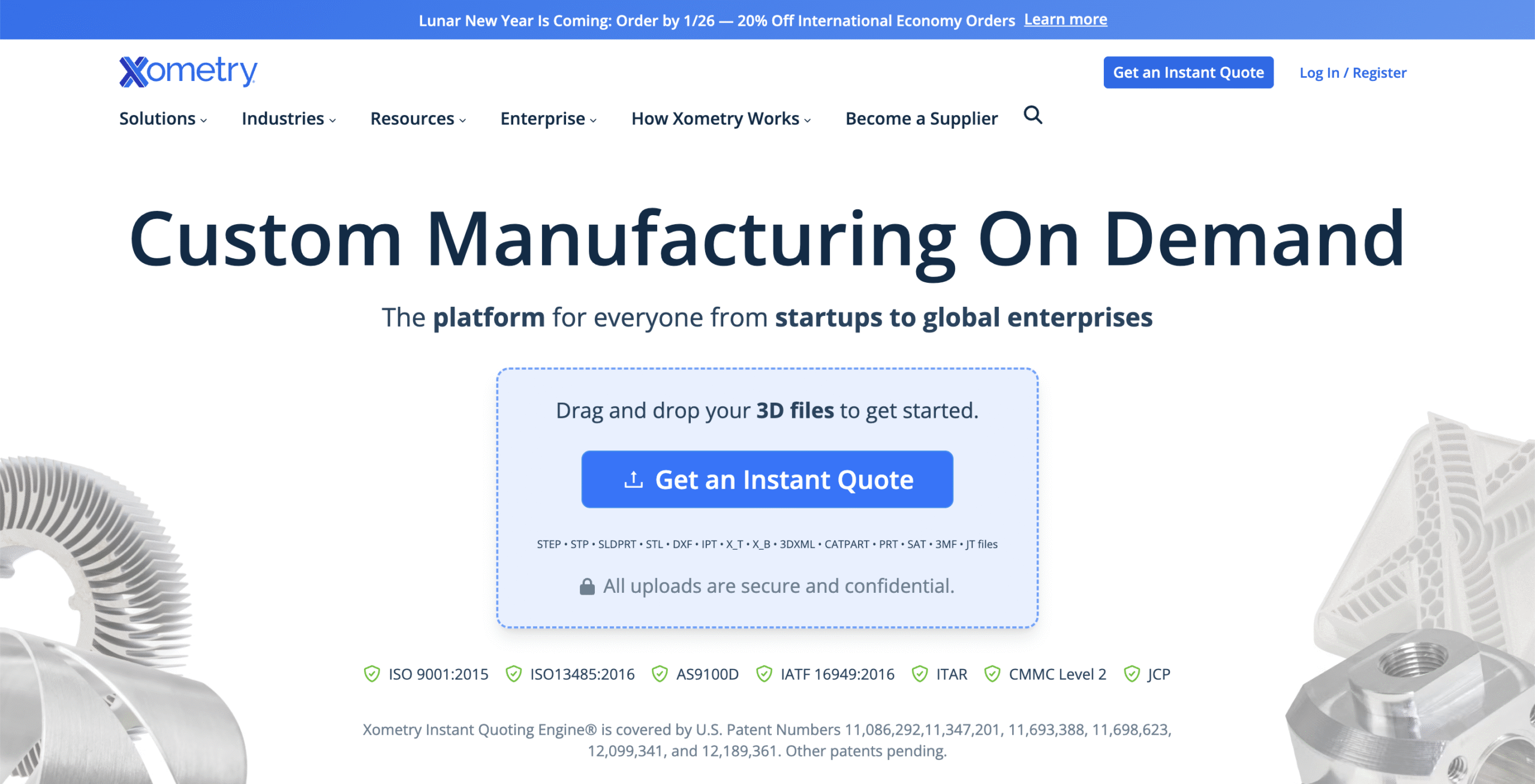
Xometry is an on-demand custom manufacturing platform that connects engineers, product teams, and procurement with a global network of vetted manufacturing partners. It covers CNC machining, sheet metal fabrication, injection molding, 3D printing, and more.
Xometry is often described as “manufacturing as a service” because it abstracts away the process of supplier discovery behind software while still delivering real physical manufacturing parts at scale.
Website: Xometry
What I like about Xometry:
- The site uses a Modern B2B SaaS / Industrial Marketplace design system.
- They push the core action immediately with the “Get an instant quote” button. This is actually rare in manufacturing where most sites hide quoting behind sales forms. It shows that Xometry is really embracing modern web and digital marketing best practices. That simple button helps them shorten time-to-value to a single interaction.
- Their CTA also feels low-risk and transactional, which is perfect for engineers who want to test before they talk.
- They use product renders and neutral photography over stylized art, which is critical for manufacturing trust
What I learned from all those B2B websites
- Takeaway 1: B2B SaaS websites are so fancy and wild with all the visual effects and “magic”. However, you should always stay grounded. A fancy website that fails to communicate the value of your business to customers is a bad website. You’d rather have a mediocre website that clearly outlines what you do (and even gets you ranked on Google) rather than a fancy one that confuses them.
- Takeaway 2: If you plan to acquire customers in the long run with SEO, make sure to dedicate a blog section to it.
- Takeaway 3: A good website incorporates the brand into every single part of it.
If you’re concerned about optimizing your B2B website for SEO, you may wish to contract with an agency such as ours to conduct an SEO campaign. You can reach out to us here.
